When we were designing, we aimed to address listed bullet points below in our solution.
Wireframes
Use your cursor on the Figma board above to see wireframes more closely
Text Styles
Visual Design
Impact Navigation
Contact
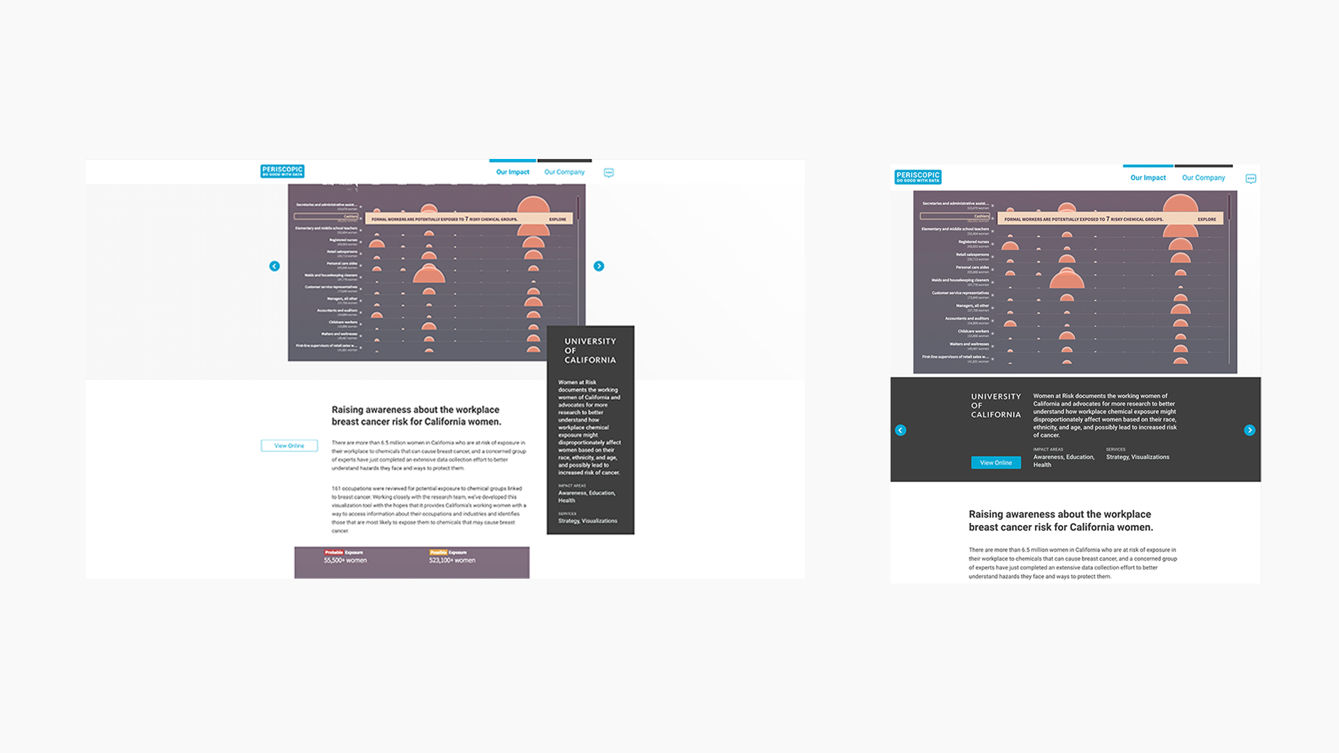
Computer vs Tablet
In the detailed impact page transition from desktop to tablet, the combination of UI elements into the meta card makes the layout more approachable.
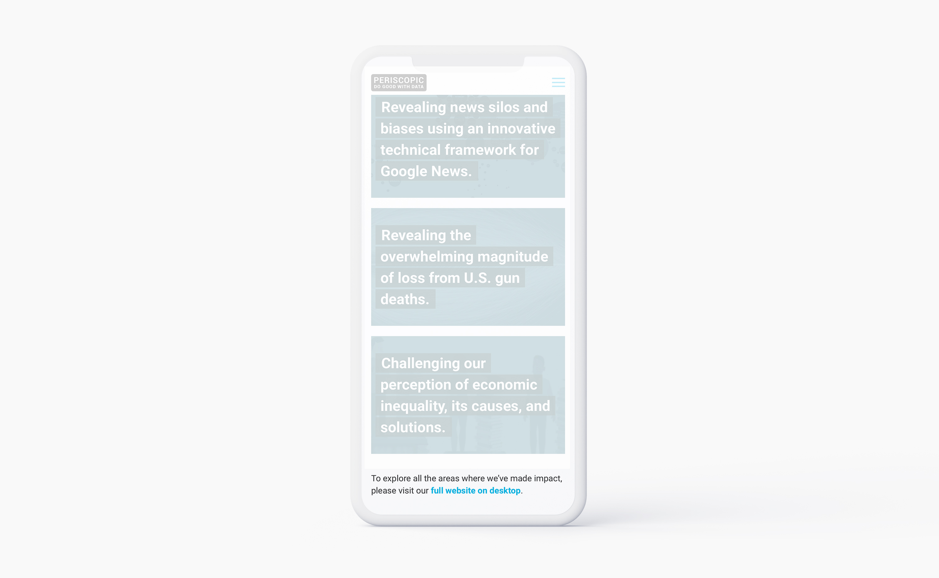
Mobile Design
The mobile screen size was difficult to display Periscopic’s portfolio on because many of the interactive data visualization projects were created for computer screens. We created two different interfaces for mobile screens to avoid not capturing mobile visitors' interest and to increase accessibility.